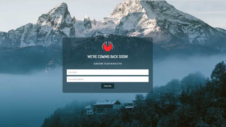
Coming Soon Page Example
Written by webtechs

How to create a Coming Soon Page

Coming soon pages are very helpful and there is no doubt about that. However, when it comes to creating a coming soon page, most of the people out there suck at it. They do believe that it is a way too complicated task to perform.

So the question is How to create a Coming Soon Page? Well, it is not as hard as it seems. In fact, it is as easy as installing a WordPress plugin on your website.

In case if you are still confused about the whole process. Well do not worry, I have got your back. As you read further in this article, I will be talking about how to create a coming soon page using a WordPress plugin. But before that let’s just have a look at what coming soon page stands for:

What is coming soon page?

Coming soon pages are often considered as the notice board of a website. As the primary goal of the page is to let the visitors know about the website launch date.

However, it can be used in many ways. By using a coming soon page one can promote their social media accounts. Or they can simply use it to talk about their business and product.

It is quite a helpful thing and there are many people who recommend starting a website with the coming soon page. In case if you are thinking how can you create one, then do follow these steps to create a coming soon page:

How to create a Coming Soon Page

As I have just mentioned that I will be using a plugin. So let’s just go ahead and talk about it, so that you can understand in a better way.

For our tutorial, we will be using this plugin called Minimal Coming Soon & Maintenance Mode. It is one of the best plugins when it comes to building coming soon pages.

A Perfect Coming Soon Page Done In Minutes

The plugin is also available in free and premium versions. In addition to that, it offers a hell lot of features. Also, you will not face any struggles while getting started with it.

With the help of the Minimal Coming Soon & Maintenance Mode, you will quickly set up a coming soon page, maintenance page, landing page or launch page with ease.

It is a simple yet flexible plugin that works with every WordPress theme and plugin out there. You can also connect the plugin with the MailChimp API thanks to its built-in support. In addition to that, it is GDPR compliant.

To give you a better insight about all this, let’s just talk about some of the top features that this plugin is offering:

Top Features of Minimal Coming Soon & Maintenance Mode:

  • The pro version of the plugin comes with more than 50 themes. You will also get more than 26 Instagram Filters and more than 47 content animations.
  • You can easily use the plugin with different WordPress themes and plugins without any issues.
  • It offers you a lot of customizable options. As a result, you will easily be able to design a great coming soon page. These customizable options include, background color, cover image, fonts, logo and so on.
  • It comes with more than 400,000 premium images.
  • Each and every element of the plugin can be easily configured.
  • You can also preview a page before activating it.
  • It comes with SEO preview and analysis tools that help you rank your website since the day one.
  • You can rearrange the position of the page elements by dragging and dropping.
  • You can also add custom HTML and CSS.
  • It lets you collect Emails with MailChimp.
  • It also comes with a feature that let search engines view your website as a normal one. Where the visitors will get to see the coming soon page.
  • It allows you to track the visitors using Google Analytics.
  • It comes with more than 800 Google Fonts which you can use to create your favorite website.

So those were a couple of top features of the Minimal Coming Soon & Maintenance Mode plugin. Anyway, now coming back to our main question that says How to create a Coming Soon Page. Simply go through these lists, and you will be good to go:

How to create a Coming Soon Page using Minimal Coming Soon & Maintenance Mode plugin

Step 1: First of all go to your WordPress dashboard.

Step 2: From the sidebar menu click on plugins and then click on add new.

Step 3: Over here you have to search for the Minimal Coming Soon & Maintenance Mode plugin.

Step 4: After that install and activate the plugin and then go to the plugin settings.

Step 5: From here you have to select themes. Then choose whichever theme you like. It has a wide range of themes that suit every type of business. However, with the free plan, you will not get many options.

Coming Soon Pages

Step 6: Once you have chosen a theme click on the activate button.

Step 7: After that go to the design menu. From here select layout and make changes by dragging and dropping elements. Also from the design menu, you can do a hell lot of things. Like uploading a logo, background image, social icons, countdown timer and so on.

Step 8: In the next step go to the Autoresponder and Emailing service and set up the MailChimp.

Once everything is done, simply save the changes and enable the coming soon toggle. That is it, now go back to your home page and see the coming soon page and test it.

Final Words

So that was all the steps that you have to follow to create a coming soon page. However, apart from these features, there are also settings for SEO. So do not forget to have a look at that.

Anyway, if you have any more questions to ask. Then do feel free to leave a comment below and we will surely help you out.

Small Business Website Design Tips 2018-2019
Written by webtechs

8 Website Design Tips to Help Your Small Business Succeed in 2018

If you are searching for “small business website design tips” in 2018 or 2019, this post should help! Did you know that there were 28.8 million small businesses in the US which covered 99.7 percent of businesses in the whole country as of 2016? Fascinating, isn’t it? Well, even though the statistics suggest a massive growth in the number of small businesses in the country, it is also true that one out of every five small businesses fails to make it to the second year.

While there are several reasons for the failure of such a huge number of small businesses, not having a functional website is one of the crucial ones that hurt a business the most. Whether you are running a pizza store or willing to help students with assignment help, you need to create a website. But that is not going to be enough to lead you to success. Here are some useful tips that can help you design an efficient website.

  1.   Make the website mobile-friendly:

In today’s date, most of the users access the internet on their cellphones. In fact, a report from Statista suggests that around 49.7 percent of web page views are done on mobile devices that suggest the mobile-compatibility of a website is going to play a big role in 2018-19. So you need to make the website design more responsive to mobile devices. It has technically become mandatory for all sites since Google started ranking pages as per then mobile-compatibility.

  1.   Prioritize the navigation menu:

Not having clear navigation design is one of the major reasons behind increased bounce rates of a website. If you wish to succeed in the online scene, you need to make sure the visitor can navigate through the pages and discover the services that you offer them.

For a richer user experience, you need to prioritize the navigation menu while designing the site. Limit the items on the menu, ensure that users get most of the information within 3 clicks, and avoid the drop down menus to make the website get better results.

  1.   Organize the content as per their significance:

Content may be the king when it comes to developing a website, but if you don’t organize the website content properly, it is not going to deliver you the results you are expecting. Firstly, you need to hire good content writers who can deliver impressive content for your website. However, the positioning of the well-crafted content plays a bigger role in website building.

Keep the most crucial information about your businesses, like the services you offer and the pricing at the top. Since a lot of visitors go site-hopping to find a service provider online, you need to sell it to them in the first few seconds.

  1.   Use a considerable amount of white space:

“White space” is a crucial element in web designing, and in the majority of the cases, it ends up being the difference between a successful webpage and a failed one. Since you need to leverage your website to get your business running, you need to pay close attention to the appearance of the site.

White space helps you create a balanced layout, allowing the users to quickly locate the information they seek. Leave enough spacing in between the content. In fact, leave some blank spaces here and there to enhance the appearance of the site.

  1.   Focus on the visual elements:

While “white space” is important for the website’s appearance, you also need to focus on the other visual elements of the site. Images can be great components for a web page. It does not only enhance the look of the page but also explains the complicated concepts quite easily.

However, you need to use the images that are relevant to the website’s operations. Display the main picture on the homepage. Also, use high quality images that offer a sophisticated touch to the website. Furthermore, put more catchy icons for better visual appeal. Choosing a beautiful theme can reduce the workload to a great extent.

  1.   Add call to action:

If you want your visitors to learn about your services and avail them, you need to include calls to action (CTA) to the web pages. You can integrate the CTA buttons under every significant chunk of content. For instance, if you are talking about your customer support system, it is better to put “Call us” button after explaining the function of the support in details. The idea is to get the visitors to click on particular links and take actions without being too pushy.

  1.   Search engine optimization:

It is a golden rule of web designing that you need to optimize the website for search engines while designing it. Even though the requirements for search engine optimization (SEO) keep on changing from time to time, it is recommended that you follow the latest trends in web designing and build the website accordingly.

You may need to modify your website a bit every time the search engines change their algorithms, but if you want your website to feature on the top SERP (Search Engine Results Page), you will need to follow the SEO guidelines while designing the site.

  1.   Focus on the loading speed:

While the content, navigation, visual elements and SEO play a crucial role in determining the success of a particular website, there’s another factor that affects the credibility of a website – its loading speed. A study done by Gomez and Akamai found out that nearly half the visitors leave a site when it takes more than 3 seconds to load.

There are a number of things you can do to make your website load faster. If you are building a WordPress website, you can install caching plugins, disable hotlinking of content, use a content delivery network and optimize the WordPress database.

Since the success of your small business depends a lot on the efficacy of your website, you need to pay attention to every minute detail that can affect your website’s performance. These aforementioned tips are incredibly effective in building a top-notch website. So, integrate these suggestions in your web designing plan and create a website that can guide your business to success.

Nathan WilliamAuthor Bio: Nathan William is a professional web designer associated with Tophomeworkhelper.com as an expert who assists the students who often requests “help me do my assignment”.


WebTechs.Net Provides Professional Website Design Services

WebTechs.Net has been helping small business owners with website design services since 1997. We also offer hosting, local seo, content writing, video, email, Google Maps marketing and more.

Fix This Page Is Not Secure Chrome With SSL Certificate
Written by webtechs

Fix “This Page Is Not Secure Chrome” With SSL Certificate

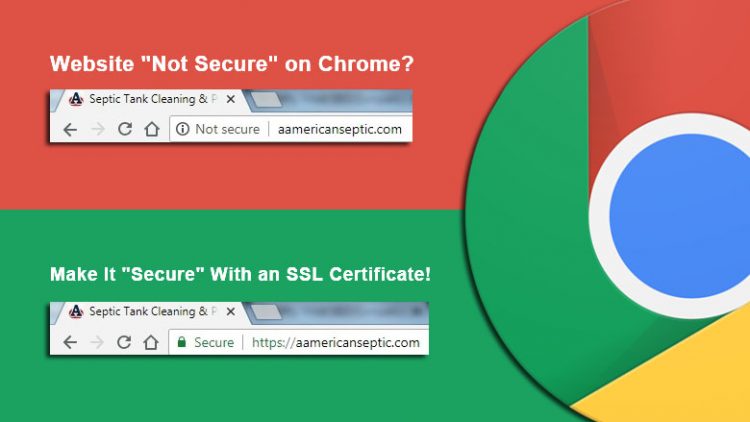
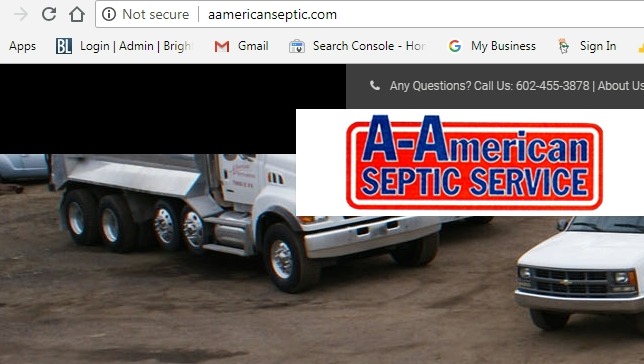
If you are getting the message “this page is not secure chrome” or “not secure” in the address bar of your chrome browser, you or the site you visited does not have a valid security certificate. Furthermore, if you are looking for “how to remove not secure in chrome” this post should help as well. First off, let’s start with why you are getting the not secure message in the first place.

Why Is My Site Showing “Not Secure” In The Address Bar?

This Page Is Not Secure Chrome

Google originally announced back in September that they would start marking sites and “non-secure” in efforts of making a move towards a more secure web. However, the Chrome 68 update just released yesterday on July 24th which will start marketing sites with a non-secure label in the URL address bar of every website that does not use an https:// secure connection.

How To Fix “This Page Is Not Secure” Message In Chrome

This Page Is Secure Chrome

In order to fix the not secure message chrome is showing you will have to install a valid SSL security certificate. But, installing the certificate isn’t the only thing you need to do. You also have to make sure that all of your URL’s in your website get changed over the https://.

What Is An SSL Certificate?

According to Godaddy, “An SSL (Secure Sockets Layer) certificate is a digital certificate that authenticates the identity of a website and encrypts information sent to the server using SSL technology. Encryption is the process of scrambling data into an undecipherable format that can only be returned to a readable format with the proper decryption key.

An SSL certificate includes the following information:

  • The SSL Certificate holder name
  • The SSL Certificate expiration date and serial number
  • A copy the the public key
  • A digital signature of the SSL certificate-issuer

How To I Get or Install An SSL Certificate?

There are multiple paid and free options for installing a SSL security certificate. Most commonly, website owners use their web host to install their security certificate for them.

Paid SSL Certificates

Install SSL Certificate With Godaddy To Remove Not Secure Warning

Godaddy is one of the best options for paid SSL certificates as they offer a year subscription for only $75 a year. However, this is just the cost to buy and install the certificate. This price does not include them changing URL’s and fixing mixed content issues to get your site showing the padlock or secure message. And, you should also know that I purchased an SSL certificate from Godaddy (where I host one of my personal sites) only to find out after purchasing that you have to fix site URL’s and mixed content yourself or pay them another $150-$200 to fix it for you. Also, your security certificate could break due to WordPress updates, hacks etc., and they will charge you to fix these issues again.

Fail Proof SSL Certificates

Never see that dreaded “not secure” message in your browser ever again with WebTechs.Net. We at WebTechs.Net charge more for SSL certificates but will fix any new or ongoing issues to keep your SSL certificate valid and showing “secure” at all times. We can fix sites that show the “not secure” message in Chrome and also offer any additional web services you may need like PPC, SEO, Web Design, Hosting, Email and more.

Free SSL Certificates

There are some places out there that offer free SSL certificates, like Let’s Encypt, however, it is not advised to this on your own unless you have coding knowledge and some form of experience with C panel etc.

How to Change URL’s To Https:// In WordPress

An easy way to change all of your URL’s in your website at the same time in WordPress is by installing a plug-in called batter search and replace. Simply choose to replace all URL’s that are http:// with https://.

However, you will still experience some mixed content issues that will prevent your https:// url from turning green in Chrome, 1 of the signals that will tell if your certificate is installed correctly. If your certificate is not installed correctly could still see https:// but it still won’t show secure. You should also know that just using better search replace on its own won’t fix all of the URL issues. The better search replace plugin cannot access whatever information is in a slider. You will have to manually replace the images in your slider to get the secure message showing. Even 1 link that is still http will prevent your address bar from turning green and showing the “secure padlock”. Furthermore, sometimes the widget section and footer sections of websites will hold on to those URL’s as well so manually replacing those should finish up the job.

How To Figure Out What’s Wrong With Your Existing SSL Certificate

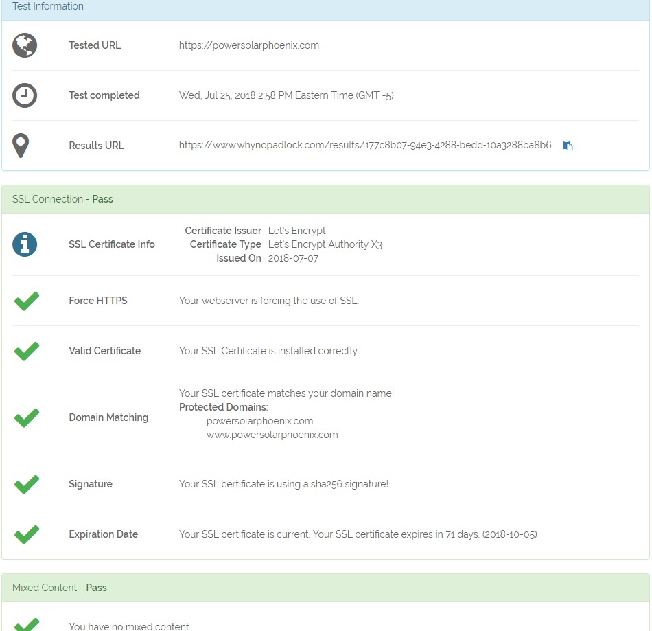
SSL Shopper and Why No Padlock are 2 great places to see if your security certificate is installed properly.

If your certificate is installed correctly you will get a screen that looks like this:

How To Check Your SSL Certificate

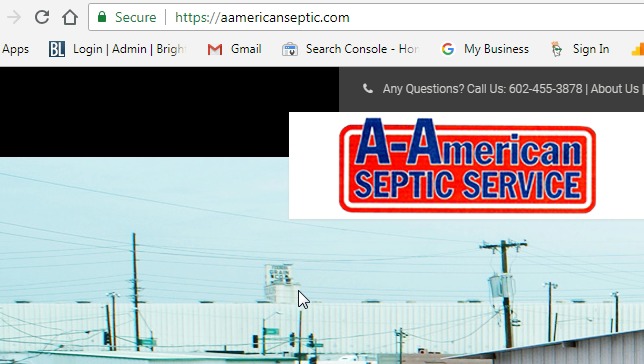
And, your address bar will look like this:

Site Showing Secure Message In Chrome

If your site did not pass, follow the list provided to fix any mixed content issues (99% of the time this is what’s holding your site back) and replace URL’s that are still http in your site. An easy way to look is by “right clicking” with your mouse on your webpage and viewing the source code. Push control +f if you are on a PC and type in http in the search bar. This should pull up any links that are still showing http, most likely images, and give you an idea where you need to look. If its an image just replace that image with a new one or the same one and your site should automatically change the URL of the image to https://.

Are You Still Not Showing “Not Secure” After Installing SSL Certificate?

If you are still having problems getting your site to show as secure. You should know that forcing 301 redirects and fixing mixed content are 2 of the biggest reasons why your site won’t show as secure.

An easy way to fix this is with a WordPress plug-in called Really Simple SSL. Really simple SSL will give you the option to force https 301 redirect requests in the htaccess file (file that gets read before anything else in your site) and fix mixed content. 9 times out of 10, just installing this plug-in will fix the problem and allow your site to show as “secure”. Furthermore, buying the pro version of Really Simple SSL will give you even more options if just installing the free version doesn’t work for you.

Need Help With Getting Your Site “Secure” With Https?

Buy SSL Certificates from WebTechs.Net. We have help 1000’s of website owners fix their “not secure” message in Chrome with SSL certificates. We can install your certificate and make your site show the “secure” padlock. Contact WebTechs.Net today to find out how easy it is to get SECURE today! Give WebTechs.Net a call today at (480) 348-0550 ext 105 or fill out our contact form.

8 Tips To Design A Good Website
Written by webtechs

8 Best Tips To Design Websites Like A Professional

In 21st century, e-commerce is dominating the business world. With online selling overtaking traditional methods of trading, the need for websites has increased remarkably and so has the demand for website designers.

A web designer must be both creative as well as technically skilled and should use both the attributes to build and design websites. It is the role of a web designer to make sure that a site looks attractive and is highly functional at the same time.

With digital media occupying a significant place in our lives, a web designer has a vital role to play in this new wake of digitalisation. Think about this – from Google to WhatsApp, from Amazon to Facebook – a good interface is quintessential nowadays.

While the job of designing web pages can seem to be quite an easy task, it definitely is not. Ask any web designer around you, and he or she will tell you how many things must be considered while designing a website. To make it look its aesthetic best, it is crucial that you select the appropriate colour palette, font, and layout and images for the website.

It does not end here! While keeping it visually attractive is essential, a website should also be user-friendly. As a web designer, it is your responsibility to create the appropriate look while ensuring that the site is easy to access.

If you are wondering how to design a webpage that is aesthetic and at the same time easy to use, here are 10 tips for you. Use these to create web designs that look like they have been designed by professionals.

8 Tips and Tricks for Website Designing

If you are a novice when it comes to designing a website, then these tips are sure to be helpful for you.

  1. Design off-screen first

Rather than creating code and designs on the screen first, try designing on paper so that you can save the time that is wasted in editing and cleaning unwanted things later. Putting the layout that you have in mind on a whiteboard will help you figure things more easily and get you a clear idea of the site first. Use a paper to jot down the specific elements that you want on the webpage and decide their positions by drawing them out.

  1. Soothing Colour Palette

Every good website designer draws on a grayscale first and then adds colour to the elements within the layout gradually. While designing a website for the first time, you must remember this too. Opt for a layout and a colour scheme that is unique and visually aesthetic. Try to keep it as simple as possible.

  1. Easy-to-use Navigation

Remember: the simpler the navigation, the better it is. A website that has many layers is usually complicated to use which in turn brings less traffic to the site. According to a survey, web pages, which take 2.4 seconds to load, experience great mobile conversation rate of 1.9%. Hence, you must use more straightforward layouts for the website that have minimal navigation. Make it a point to use as few drop-down menus as possible. Keep in mind that the menu links on the website page should include the vital items that the visitors mostly want to see – the About Us page, the Home page and the Contact page.

  1. A Clean Layout

A lucid and straightforward layout is crucial for a good website. So go for a design that does not look too crowded. You should also avoid using too many search boxes or buttons. And yes! Flashy banners and complicated graphics are a strict no-no, and you should not use sliding carousels either.

  1. Easy-to-understand Font

40% of people will switch to a different search result if the first one is not mobile friendly. Make sure that the size is not too small so that the viewer does not have to zoom in to read what is written. Use fonts that are prominent for the headings so that, it grabs the viewer’s attention. Some of the fonts that you can consider using on a web layout are Calibri, Arial, Cambria and Times New Roman.

  1. Using Phase out sliders

Be it sidebars or the sliders – if you are using them, make sure you phase them out in the webpage so that the number of distractions on your site is minimum. This way it will be easier for users to navigate through the website. For the home page, it is better if you opt for a large header space. Use a unique and well-crafted design to define the brand. Make sure that you choose an icon that can be considered static.

  1. Minimal Content

Good content is the essence of a good website. Hence, you make sure that the content is aligned perfectly so that the website does not end up looking too clumsy. Keep in mind that a site that has a lot of material on it does not receive traffic. Hence, be minimal and opt for graphics instead to show content.

  1. Use the space

A cluttered webpage can be quite distracting to the users and so you recommend you to use more space in the layout. Rather than trying to include multiple elements on a webpage, opt for a layout that leaves empty places within the site. This will help the viewer to focus on what is important. Although known as whitespace, it is not necessary that you keep the space white. Use subtle colours that are not too eye-catching to make the readers more focused on important things.

Best Web Designing Trends for 2018

In the year 2017, we saw mobile usage overtaking desktop browsing. Keeping that in mind, let us see what 2018 has in store for web designers.

1. Drop shadows and depth

Shadows are in this year, and web designers are using grids and parallel layouts to play with shadows more to create depth and an illusion.

2. Vibrant, saturated colour schemes

2018 is the year for a colour splash online. More and more designers are breaking stereotypes and going for vibrant shades in the headers. Use contrasting colours to attract visitors’ attention.

3. Mobile first

Mobile browsing has surpassed desktop, and that is precisely why you must make a website keeping mobile in mind first. So let go of the images and opt for icons to save space.

4. Custom illustrations

Illustrations being considered the next big thing by many famous website designers and therefore try to use them to create images that are vibrant and playful. This helps you mellow down the formal tone of a website and makes it friendlier in approach.

  1. Integrated animations

2018 is the year for better integrated animations and, therefore, you must get rid of static images and start using animations to make a website more engaging. Use integrated animations and GIF files to make the site more fun.

6. Dynamic gradients

Over the last few years, we have seen the website designers use dynamic gradients to make the website look as vibrant as possible. Now in 2018, once again the designers are choosing dimensional colours over flat designs thus marking the comeback of gradients in this year.

With e-commerce looming large over the traditional business practices, website designing has a lot of scopes and earning opportunities. Easy as it may sound, website designing needs a blend of creativity as well as technical skills. However, the above tips are sure to be of great help to the beginners to design a website like a pro.

Author Bio: Gracie Anderson  is a celebrated web designer who has several brilliant websites to her name. She is an active blogger and a marketing strategist heading one of the biggest web solutions agencies in the Singapore. She is also associated with myassignmenthelp.com/sg and extends essay help to students pursuing web designing.

WebTechs.Net has been offering web services since 1997. We can handle any type of website design you may need!